
Overview
Washington DC Digital ID explores how a digital ID can provide a convenient and secure way of accessing a drivers license from the smartphone.
UX Designer
What's the Problem?
The Solution: DC Digital ID!
research
Examining the Current Washington DC License
I looked at the physical Washington DC driver’s license to understand what was working well and what needed improvement.
Strengths:
Illustrative background adds flair to the design and shows off characteristics of the city
Text is legible and easy to see against the background
Weaknesses:
Is overwhelming with information and graphics
Information is disorganized without any sort of hierarchy
The Fredrick Douglass Bridge featured in the background is a generic landmark - there are more iconic landmarks to choose from

Comparative Analysis
I explored various apps to understand the strengths and weaknesses of the current product space. Not only did I look at digital identification apps, but I also looked at ticketing apps to understand how to implement security features into my design.
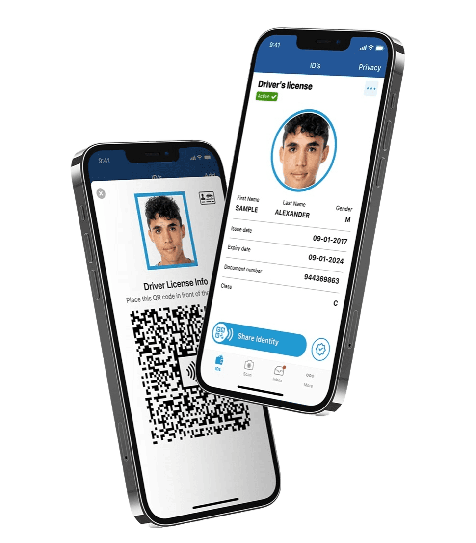
New York Mobile ID
Strengths:
Displays information in an easy to digest format
Convenience and functionality
Weaknesses
Tight spacing between elements
Lots of whitespace and disengaging design
Fails to utilize the opportunity to create a unique digital translation of the NY ID

California DMV Wallet
Strengths:
Clear navigation throughout the app
Fun and engaging design with the use of bright colors and rounded corners
Weaknesses
Fails the capture the unique characteristics of California
Generic corporate illustrations
Tight padding around the sides
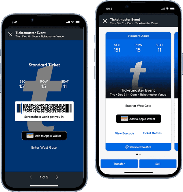
Ticketmaster Mobile
Strengths:
Changing barcode enhances security
Displays seat information clearly
Option to add ticket to mobile wallet
Weaknesses
Overlaying text on the background image poses accessibility issues
With these findings in mind, I knew I wanted my solution to be easy to navigate, accessible, and incorporate branding unique to Washington DC.
ideation
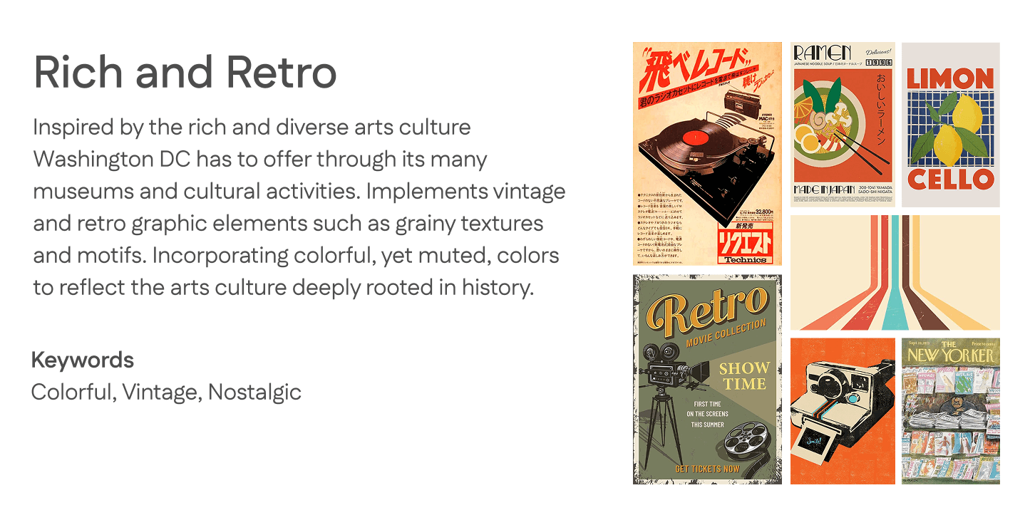
Visual Directions
I created two possible visual directions for my design to give myself guidance for the styling.

Sketches
I sketched out some rough ideas for my design. I played around with different layouts for displaying the photo, name, and information. I also thought of some elements I wanted to include to represent Washington DC, such as The Capitol and Washington Monument.


Wireframes
I laid out the compositions from my sketches in mid-fi wireframes. In this iteration, the user is only displayed with some of the information at first in the full view, but it can be expanded. The navigation bar at the bottom allows them to switch between the full view, age only view, and to scan their ID.


design
Iterations
Throughout the iterative process, I explored various approaches to my design based on feedback and evaluation. This included the screen designs, logo, and other UI elements.
Style Guide
Final Designs

Splash Screen

Full View
Age Only View

Scan ID