Overview
I explored playing cards in a digital environment through building a mobile app capable of displaying, counting, and sorting cards. I experiemented with interactive capabltes in Figma, focusing on simplification.
UX Designer
planning
Key Features
Before diving into the design, I knew I wanted to priortize these key aspects as part of my solution:
The UI will resemble the act of physically holding cards, making it intuitive for the user.
There should be error prevention to prevent users from accidently removing a card.
The design should be eye-catching and aesthetically pleasing to the user.
ideation
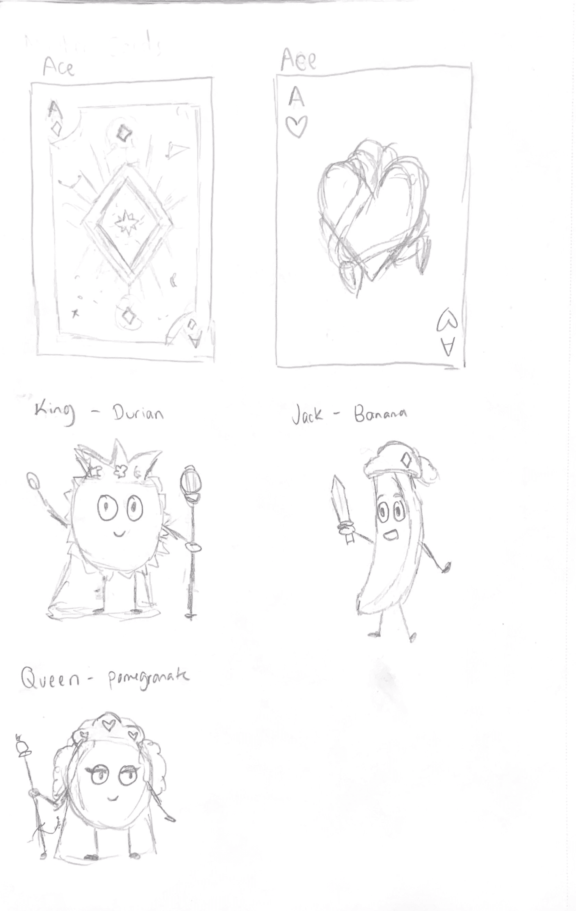
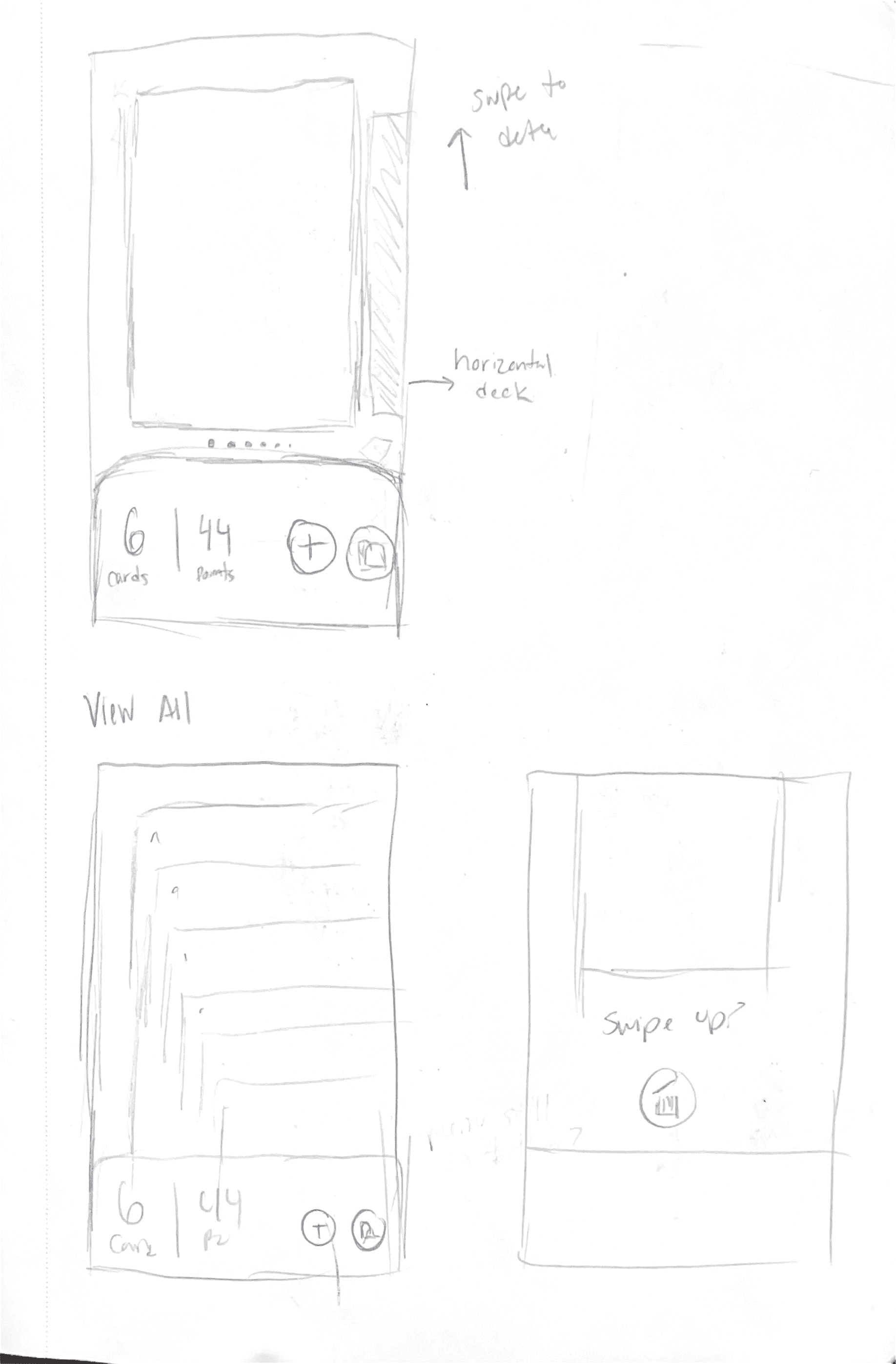
Sketches
I designed a playful and engaging theme using soft tones, rounded shapes, and fruit-inspired characters. My process included sketching initial card designs and app layouts, with a focus on horizontal scrolling to mimic the natural feel of holding playing cards.
design
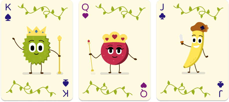
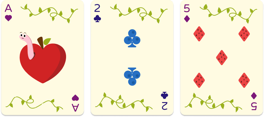
Card Designs
I designed the cards in Figma, exploring its vector and artistic tools for the first time. This experience allowed me to experiment with vector art in a new way, making the process both challenging and enjoyable.
I characterized the King as a durian, the Queen as a pomegranate, and the Jack as a banana. I incorporated vines and other fruits into the design as well.

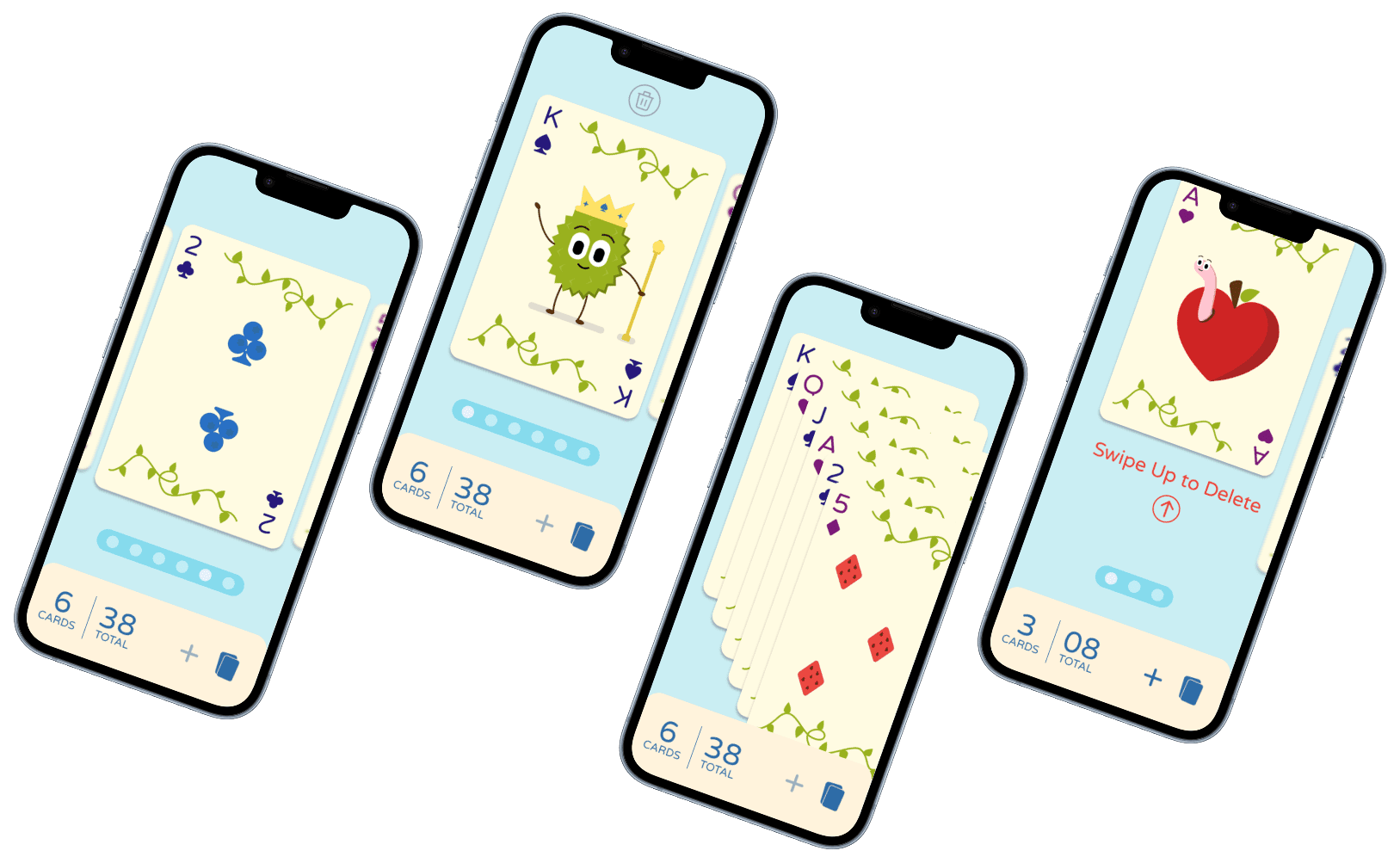
Final Frames
Swiping through cards
Horizontal swiping mimics the act of physically holding cards.

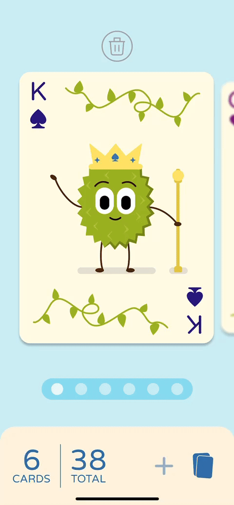
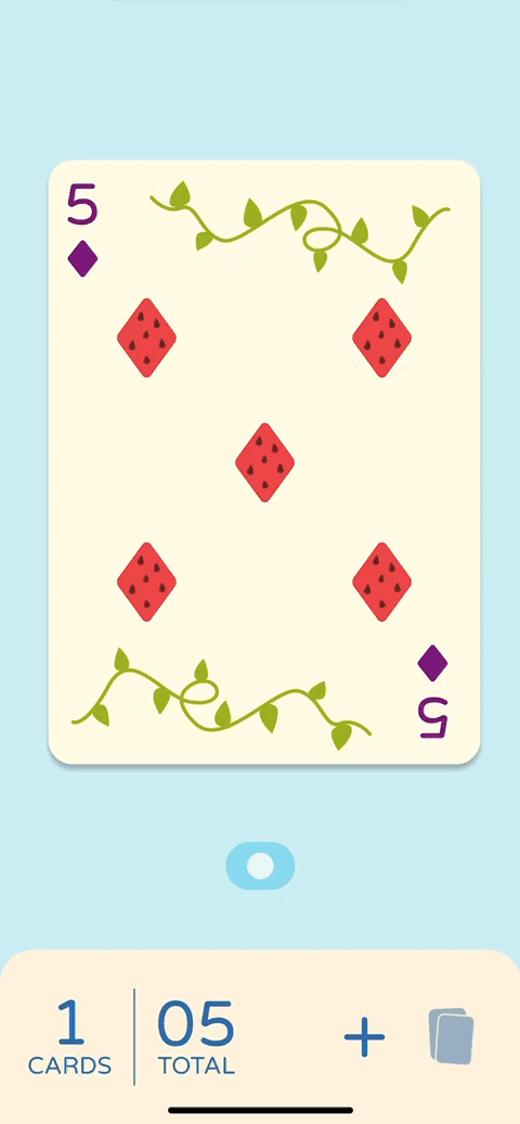
Adding cards to deck
Similar to "drawing" a card from a pile in the middle.
Similar to placing a card back in the pile. Includes a two-step deletion process to prevent users from deleting a card by accident.

Prototype
conclusion
Reflections
Stay Organized
This was my first time utilizing Figma's advanced prototyping capabilities to created animated and complex interactions. Through this, I learned the importance of being organized; it’s easy to get lost and overwhelmed with so many flows and components.
Sometimes, Less is More
This project taught that sometimes simple is best. When focusing on micro interactions, it’s important to not overwhelm the user with flashy visuals or unnecessary details. By having a simple design, I was able to design the interactions to be intuitive and easy to navigate.