
Overview
Redesigning the RIT University News website to be more visually engaging, captivating, relevant, and informative. Arranging and modifying existing content to emphasize strong visual hierarchy and support audience reading behavior.
5 Weeks
UX Designer
UI Design
Figma
What's the Problem?
The current RIT University News website is notably redundant in structure, with a lack of any eye-catching content.
The excessive white space throughout the homepage leads to space wasted and the overall navigation is confusing.
The website fails to effectively convey the university’s news to the user, resulting in reduced user engagement.
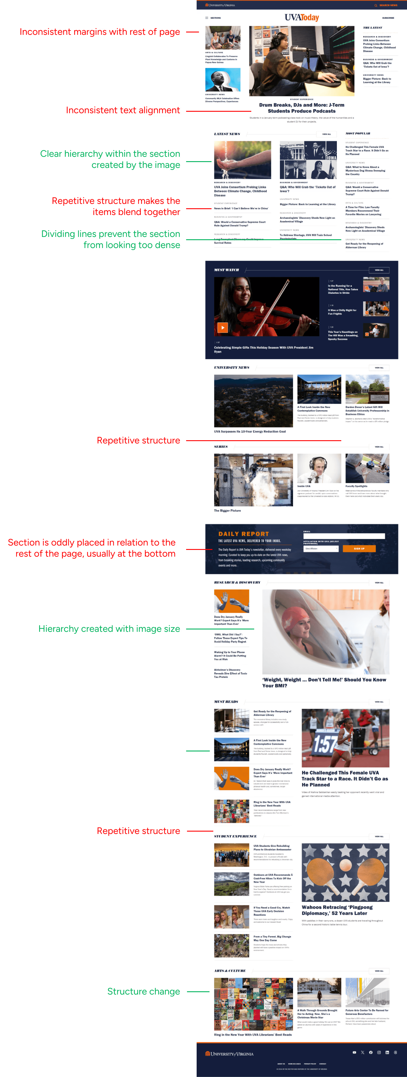
Current RIT News Website
research
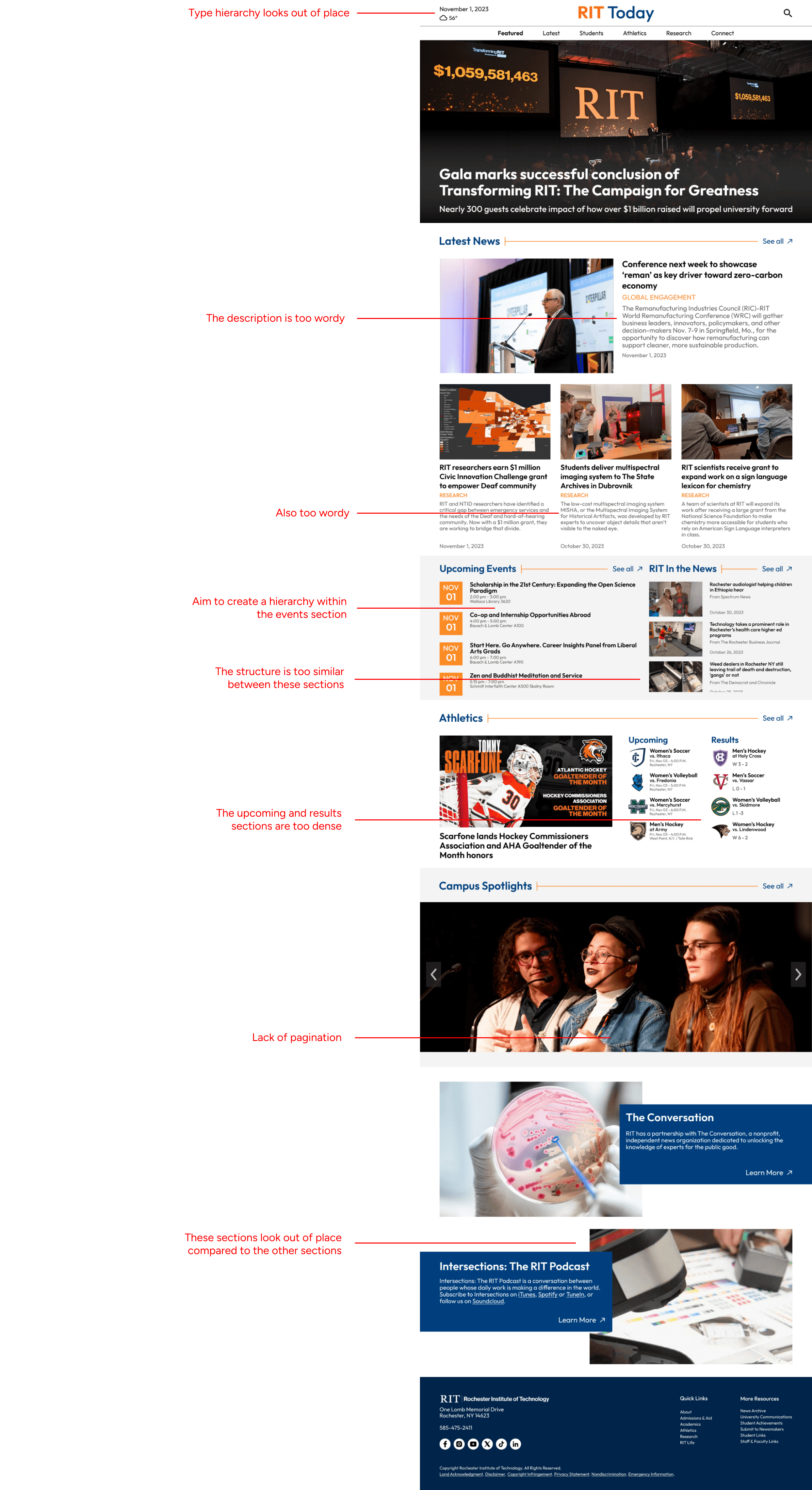
Examining Other Competitors
Before diving into the design process, I did competitive analysis to understand the trends of other university news websites: what they are doing well, what works in their favor, and what features are they lacking that we can improve on?


Summarizing my observations, I realized that varied structure layouts, consistent text alignment, and clear call to actions are important to creating an engaging experience for users navigating the website.
ideation
Sketches and Style Guide
I aimed to have a modern design to align with RIT’s brand of being innovative and technology-focused. I created this through the use of sharp shapes, simplistic/minimalist layouts, and sans-serif typography. I also implemented blue in the color scheme to contrast RIT’s bright orange, creating a more harmonious color scheme.

Sketches

Style Guide
design
Wireframes
With my initial sketches and visual direction in mind, I created a black and white wireframe to establish the overall structure of the homepage. This allowed me to think of the page at a higher-level, without getting too bogged down by the content. I received several notes of feedback, which I aimed to improve on in the next iteration.

Preliminary Design
I added color and refined the content of my design while adjusting it based on instructor and peer feedback. Following this iteration was another round of feedback, which I aimed to implement into my final design.
Final Design!

conclusion
Reflection
This project was a little bit different from what I was used to, as the main goal of it was to focus on the visual hierarchy and overall UI of the final redesign, without an emphasis on interactivity. I learned the importance of utilizing grid structures in design and maintaining a balance between repetition and variation in order to keep users engaged. Since there wasn’t an emphasis on conducting user research or gathering content, I was able to focus on designing for the big picture and subtle details.